
Recommended Services
Supported Scripts
Web Design · Utrecht
Web design for member journeys.
Explain external transitions.
Account pages need clear labels, understandable states and an obvious way back to the task. A visual design should account for the experience after sign-in. Account for the design limits of external booking, checkout or account tools.
- Business websites and redesigns
- Designed for mobile, tablet and desktop
- Content and structure you can manage

MORE THAN A GOOD-LOOKING SCREEN
The message comes first.
The design makes it clear.
A useful page explains the service, answers the next question and provides a clear route to an enquiry. That is the starting point for the design.
A clear message
Explain who you help, what you offer and why the service is relevant before asking the visitor to act.
Intuitive navigation
Connect the overview, detailed service pages and contact options so the visitor can move forward without losing context.
A recognisable identity
Typography, colour and imagery work as a system, with enough flexibility for future pages.
WHAT WE DESIGN
One visual language.
Across the whole website.
We establish reusable page elements so service pages, project examples and contact details stay visually connected.
- Page structure and content hierarchy
- Core page designs and reusable components
- Responsive layouts and navigation checks
- Handover with guidance on managing your content
Business website
Give visitors a concise introduction to your business, supported by useful detail rather than generic claims.
Landing page
Keep campaign visitors focused on the information they need to respond.
Website redesign
Keep useful content and replace the structural problems that make the current site hard to navigate.
Project showcase
Give each project enough context for a prospective customer to understand its relevance.
FROM FIRST CONVERSATION TO HANDOVER
Good design starts
with the right questions.
Content and page priorities are agreed before we spend time refining individual visual details.
01
Goals & content
First we establish the purpose of the website and the information a customer needs before getting in touch.
02
Structure & design
You see the proposed structure and design direction before the full build begins.
03
Build & testing
Approved designs become responsive pages, with functional checks along the way.
04
Handover & continuity
Handover includes a walkthrough of the editing setup and an agreed list of any remaining work.
DESIGN + DEVELOPMENT
Clear on a phone.
Consistent on a desktop.
- Consistent buttons, forms and interaction states
- Readability and basic accessibility checks
- Working links and clear ways to get in touch
A FOUNDATION YOU CAN MANAGE
A website you can keep current.
For WordPress builds, the editing structure is prepared around the text and images your team needs to change.
If the project needs more than standard content pages, we define those features before including them in the build.
BEFORE WE BEGIN
Your first questions, answered.
Yes. It can guide visitors to a qualified enquiry or quote request. Decide that purpose early so product information and calls to action support the actual sales process.
Only where those screens are in the agreed scope. Identify the relevant roles and states before design begins so the handover covers the journeys the application needs.
That can expose avoidable layout problems. Use representative translated content while designing, especially for navigation, headings and buttons, and have the wording reviewed by an appropriate language owner.
They may have design limits. Aim for a recognisable identity, clear wording and an understandable handover within the controls available, rather than promising changes the external platform cannot support.
No. Prioritise the areas with a clear usability or business reason. Retain effective information and important URLs, and review the transition rather than treating change itself as the objective.
A PRACTICAL STARTING POINT
Keep the brand recognisable across languages.
Different text lengths can change hierarchy, spacing and button fit. Build the design around representative translations and clear language navigation.
01 · Prepare
List the languages, important terms and the person who can review each version. Separate translation from the decision to enter a market.
02 · Verify
Follow the same important journey in each intended language. Check navigation, forms and messages rather than the headline alone.
03 · Keep ownership clear
Assign responsibility for keeping language versions aligned when products, services or policies change.
Illustrative sequence. The actual configuration and responsibilities follow the agreed requirements.
DELIVERY & OWNERSHIP
Make the handovers understandable to the whole team.
List the people who provide information, approve changes and use the result. Separate everyday access from the ability to change important settings or publish material.
01 · Prepare
Identify who supplies copy, reviews the design and approves publication.
02 · Verify
Have the content owner and a representative visitor review headings, navigation and the intended action separately.
03 · Keep ownership clear
Record the approved design and who supplies copy, images and future page additions.
OUR WORK
Design put into practice.
Different businesses. Specific requirements.
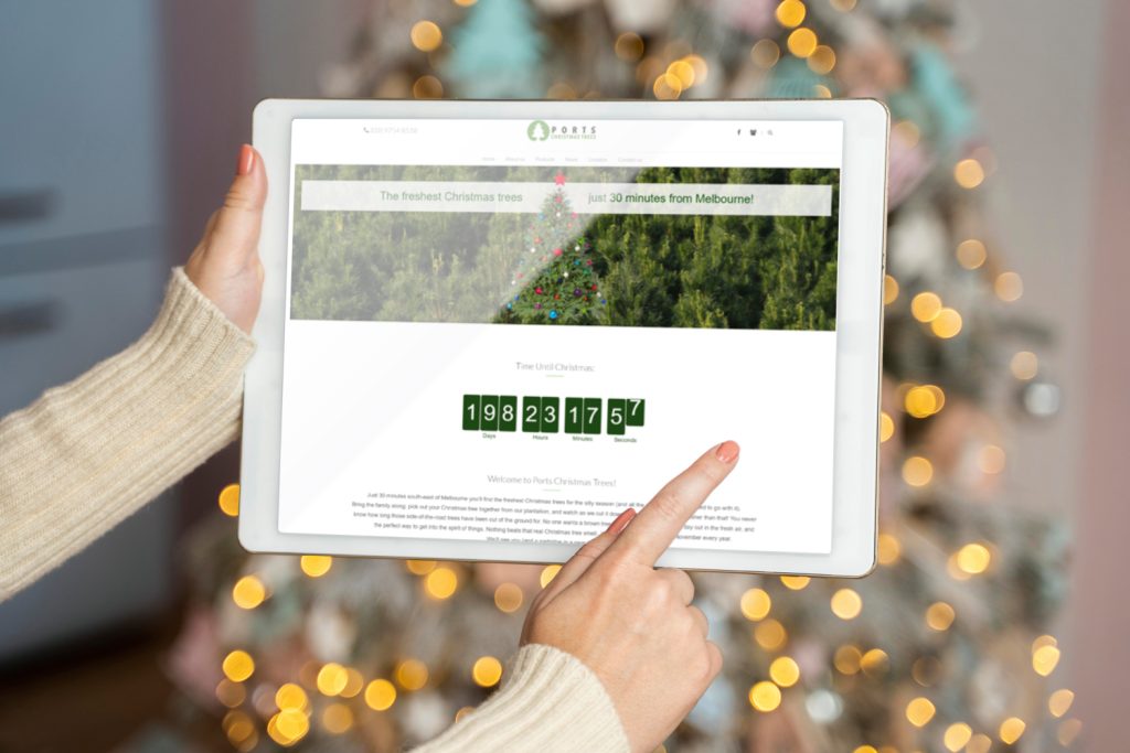
Ports Christmas Trees
Practical information for a seasonal visit
We created a website presenting location, products and seasonal opening information, with clear content to help families plan their visit.
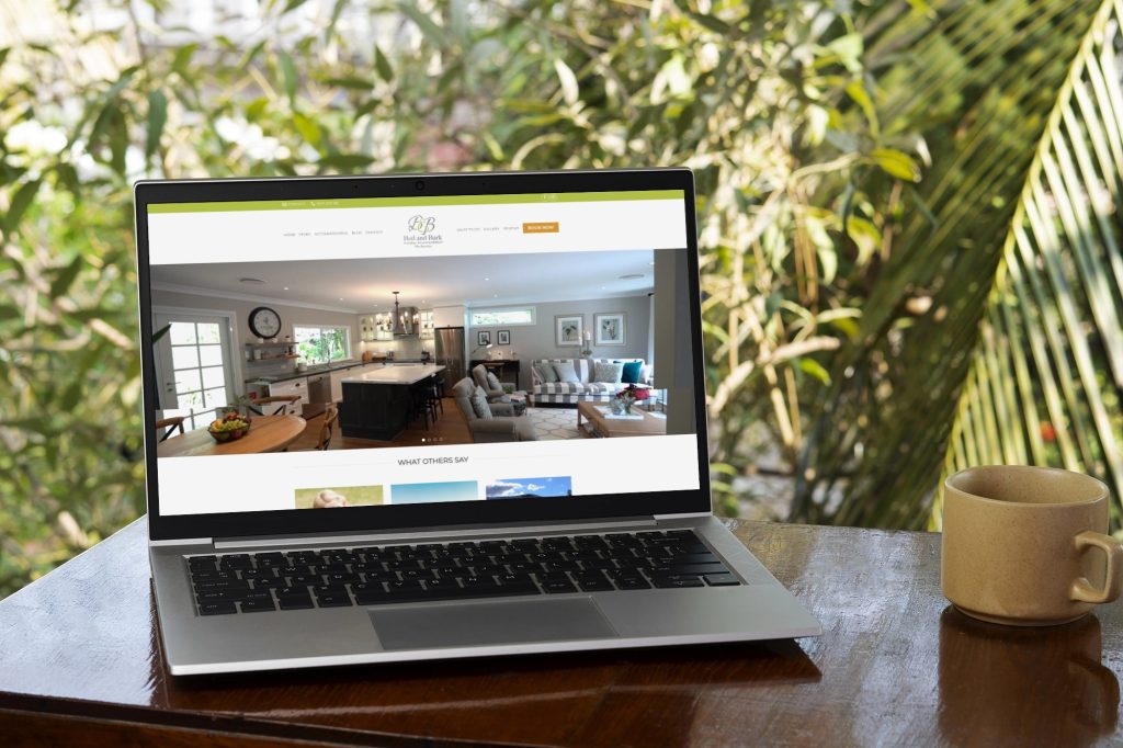
Bed & Bark
Accommodation with a clear introduction
The website tells the story of pet-friendly accommodation through warm visual design and organised information that helps guests plan their stay.
IN OUR CLIENTS’ WORDS
“They always deliver and are very creative with web design/development. They are absolute masters of WordPress. They have also been great with dealing with a large number of stakeholders within business.”
Joel K. · Jim’s Group
SERVICE AREA
For your audience in Utrecht.
More than one language.
For an audience in Utrecht, an external provider may sit elsewhere. Separate the audience location from the systems and suppliers required to deliver the service.
Account for the design limits of external booking, checkout or account tools.
The map identifies the audience area. Project scope, collaboration and delivery are agreed around the business and its users; it does not imply a local office.
- Content to retain
- Navigation problems
- URL continuity
Utrecht
THE NEXT STEP
Tell us what needs to change.
Send a brief outline of the business and the pages you need. We will help turn that into a practical starting brief.
YOUR NEXT STEP
Refresh the design while retaining useful structure.
Tell us how you expect the service to evolve and who will look after it. We can agree a handover that supports the next change.
Make content editing and future page additions understandable at design handover.